Wow, a lot harder than I thought.
Now I can spend hours or days musing over colors in an illustration, but I have well over 100 shots to layout and make bg's for...though some I'll be reusing, and some will be very simple and quick. So I don't have days to spend on each bg, and barely a few hours each really to meet a deadline next semester.
My first color test looked like this:
Bleh. It's nice and clean and professional looking, yeah. But pretty bland I was told. And I really started to see it afterwards. It only took me around 45 min to complete this one...but it shows. I was proud of getting it done fast, because I want to breeze through color without much of a thought and have a fully colored film. That's a big mistake though. I hate the way this is colored now. It's pretty flat, and the colors are really typical. My thesis professor pointed out how it looked too nice, too predictable, and others commented on how it was just looking like "another student film". I didn't want to think about color because I didn't want to make a statement in revolutionary looks or anything, but now I realize that if I don't pay attention to it at all, my whole film can suffer.
So I've been musing over color all evening, and practically at the point of pulling all my hair out. I'm without a tablet at the moment so I'm doing everything by hand. It was a real struggle at first, dabbling in watercolor again and getting it to look just right. I didn't know what kind of colors to use really, to make a scene...a mood...a good environment.
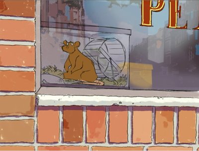
Then I finally came up with this one:

A ton better I feel. More texture too (at least for the bg), which I want to show in the film. Maybe not exactly what the final look will be, but a much nicer mix of color (not to mention an actual style now that might work a ton nicer with my animated characters). It's kinda Calvin and Hobbes - ish, but I like it. It was a lot easier to mix colors you wouldn't normally use for areas right on paper. We'll see how this goes more this week later...
By the way...John K happens to be ranting and raving about color uses in cartoons over at his blog...which I highly reccommend everyone check out. It's quite a nice coincidence that he happens to be talking about color right at this point and time. =)
8 comments:
I like the second painting a lot! You are an art student @ Pratt?
tp: yeah i'm still at pratt as a senior =)
Looing really good Jessica!
I love the feel and tone of that 2nd pic, the colors really come alive in it.
I'm in the same boat as you! here's to hoping we both have delicious films done by this time next year!
Can't wait to see more!
Cool work Jessica! You have a nice sense of design.
Hey jessica, been a fan for a time now, great blog:) i really loved how the city reflects on the glass in the first pic, really beautiful. the second pic has an older style regarding the character yet it has a lot of presence, great colors.
cheers awesome blog
Good images...
listen to john
Post a Comment